
Daily Register Website Design
Website Interface & Experience design for a digital news company ‘Daily register’. A newer news reading experience for a newer us!
Year
2022
Project Type
Personal
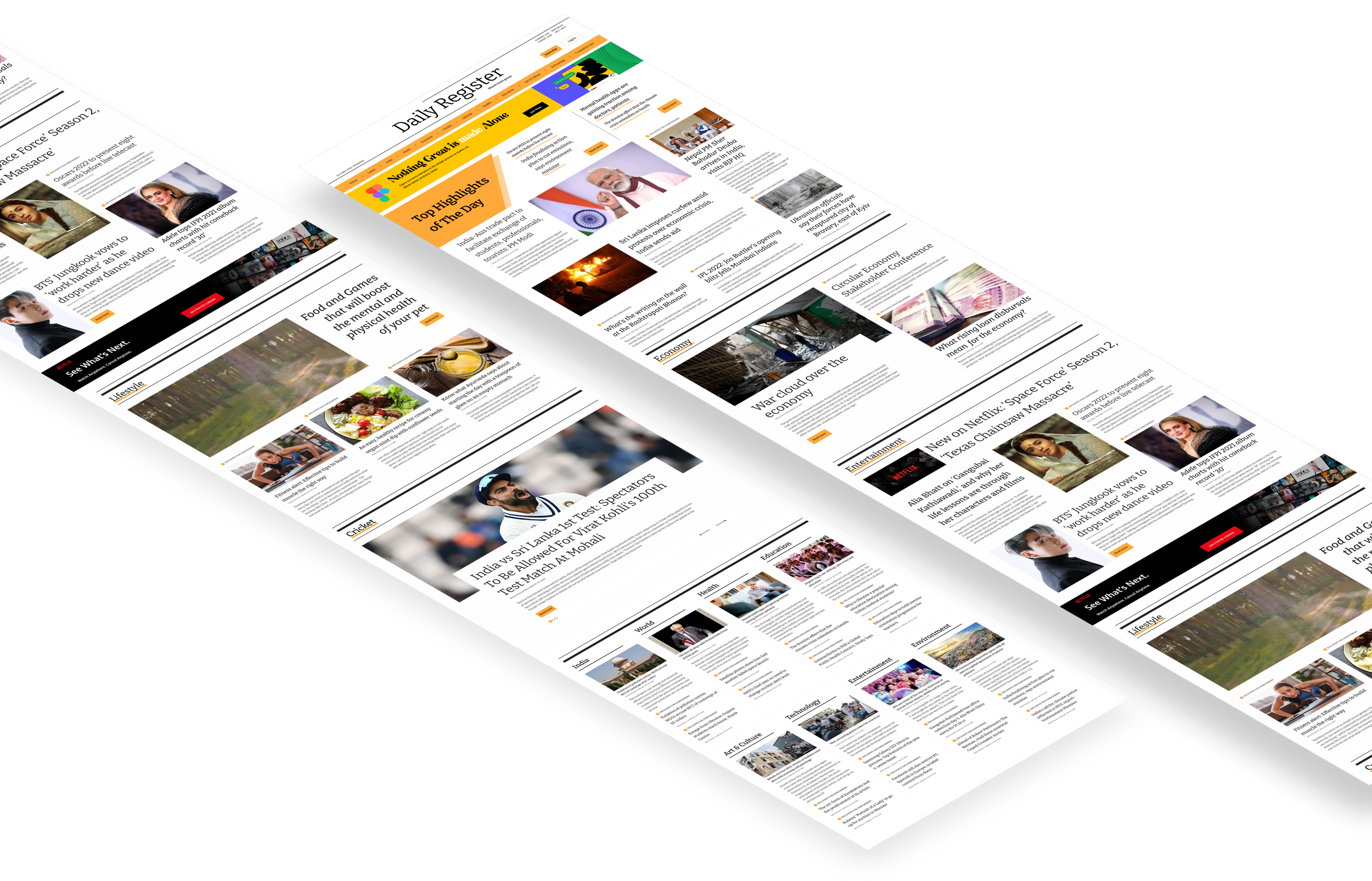
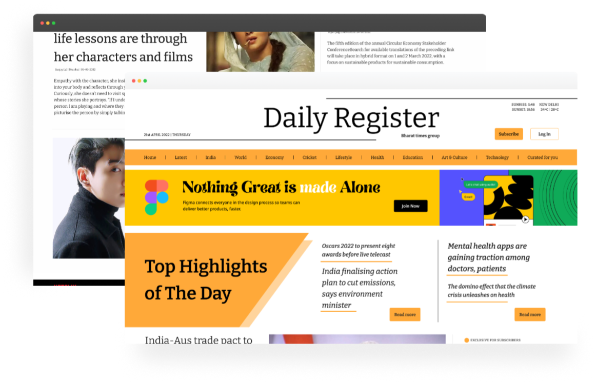
Daily Register brings a newer experience for the newer generation.
Millennials and Gen Z don’t source news similarly to older generations.
To bring a newer & better experience for Daily Register I went back in time...
When Newspapers were less Boring & More Attractive
I started my investigation on why the newer generations are uninterested in reading the news, so I asked my online acquaintance Google for help and delved deeper into this.
However, being a Gen Z myself I was more or less aware of the results I would find, however Google made my research a notch better by providing me with reliable data.
“Our Research Said That...

More than 75% of people say that digital news is boring & unattractive.
56% say that there is too much or too little content.
38% of people say that they never find topics related to their interests.
And more than 80% say that news websites are all about advertisements and pop-ups.
Breaking News
on how I plan to simplify & make the news-reading experience better?
▸Microinteractions
Interactions provide a more lively experience to users compared to static websites and enrich the product by communicating the brand in a more intuitive and fluid way, and creating a positive emotional effect on the user.
The difference between a product we love and one we tolerate is often the micro-interactions we have with it.
▸Bold Colours & Typography
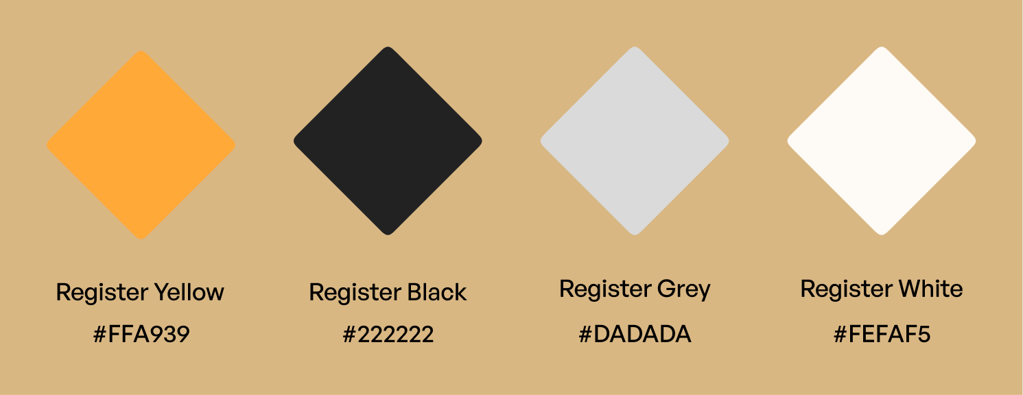
I didn’t shy away from colours and decided not to go just black and white. I chose a slightly deeper shade of Yellow, which was great for showing the brand’s positive and bold intention.
The brand message is that Daily Register is not a platform which considers news as a negative form of media and they don’t believe in fake stories. Hence the ‘Register Yellow’ as I decided to call it was the best colour to showcase and convey the brand’s vision to the world.
Just like our colours we also wanted a bold typography which is attractive, modern as well as holds the essence of a newspaper. So I went ahead with a serif typeface which resembles our conventional newspapers and also enhances the readability for our readers.
... as we say, “Exploration is the key” I did trials with 5 different typefaces while keeping the readers in mind I found the perfect typeface to match our brand personality.

▸Balance between Images & Videos
Most digital news platforms depend on static images to showcase their story but Daily Register doesn’t. I believe a story should not be frozen like static images and so I decided to add both images and videos creating a healthy balance to make things live on this platform.
▸Attention to Details
I paid a lot of attention on detailing the platform so that the users can get the most seamless experience while getting their daily dose of news.
In the next section, you can view the wireframe and final design of Daily Register.
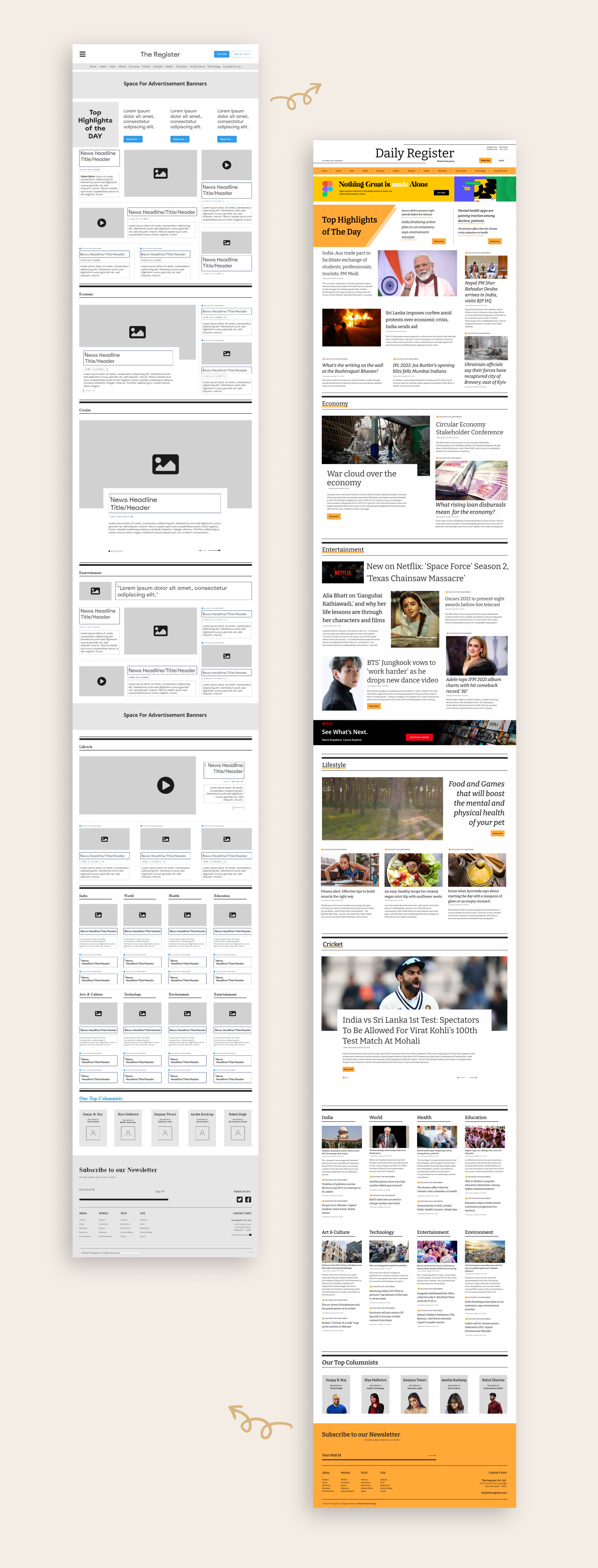
Final Design
Made with Figma
Website Wireframe
Made with Miro
Experience It Yourself!
Play the prototype and experience the platform yourself!

*Best viewed on Desktop*